The Fedrigoni 365 project is designed to foster creativity, spark conversations, and highlight the versatility of Fedrigoni’s speciality papers. I was delighted to take part as a contributor for the fifth consecutive year.
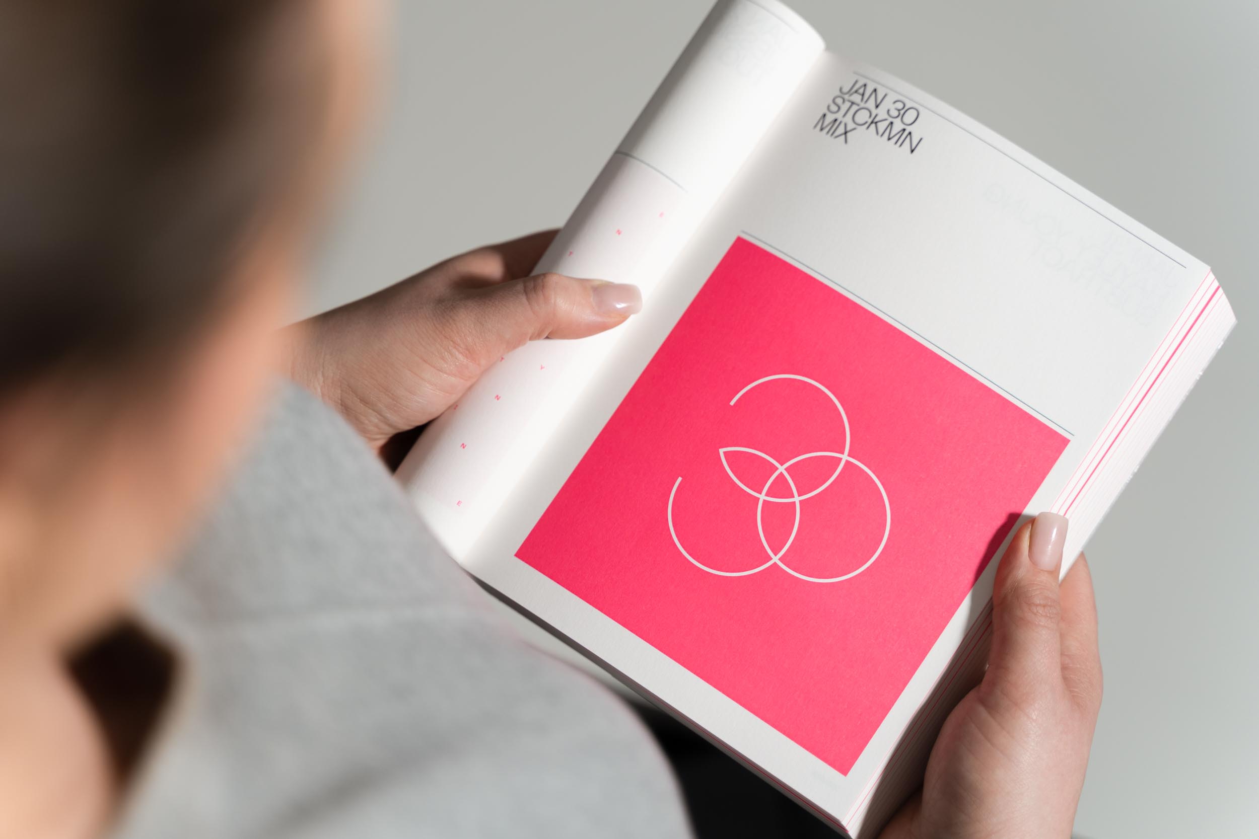
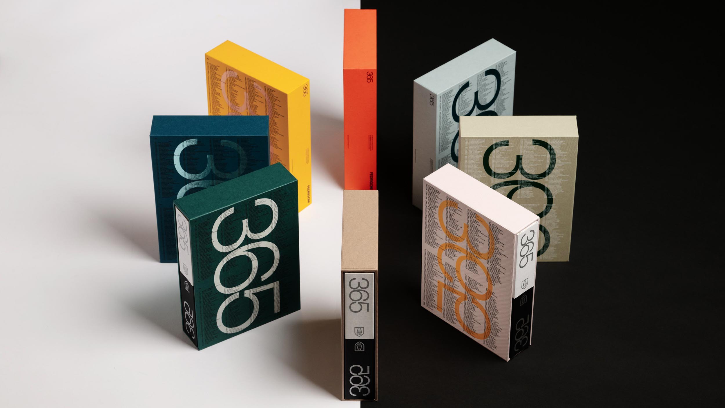
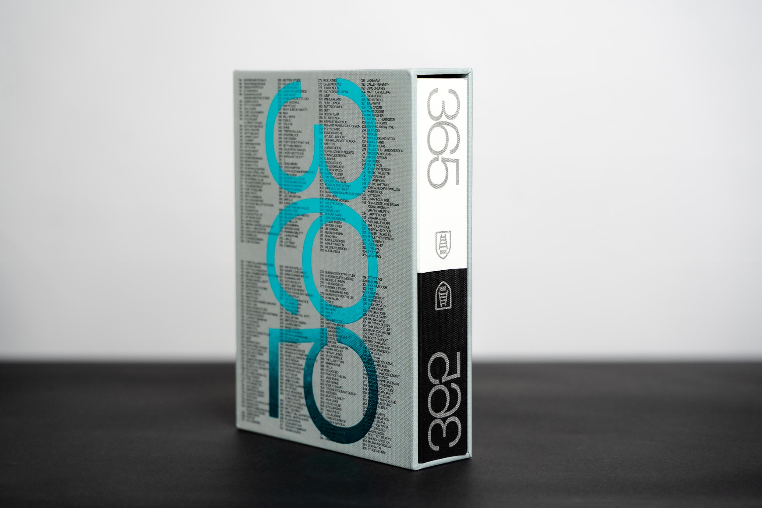
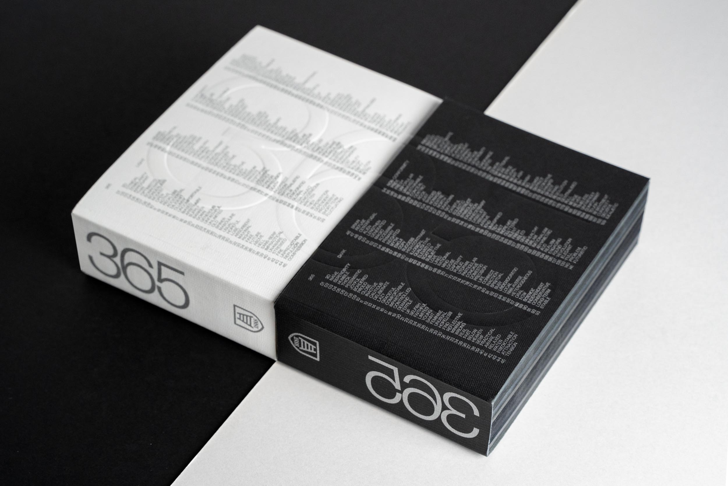
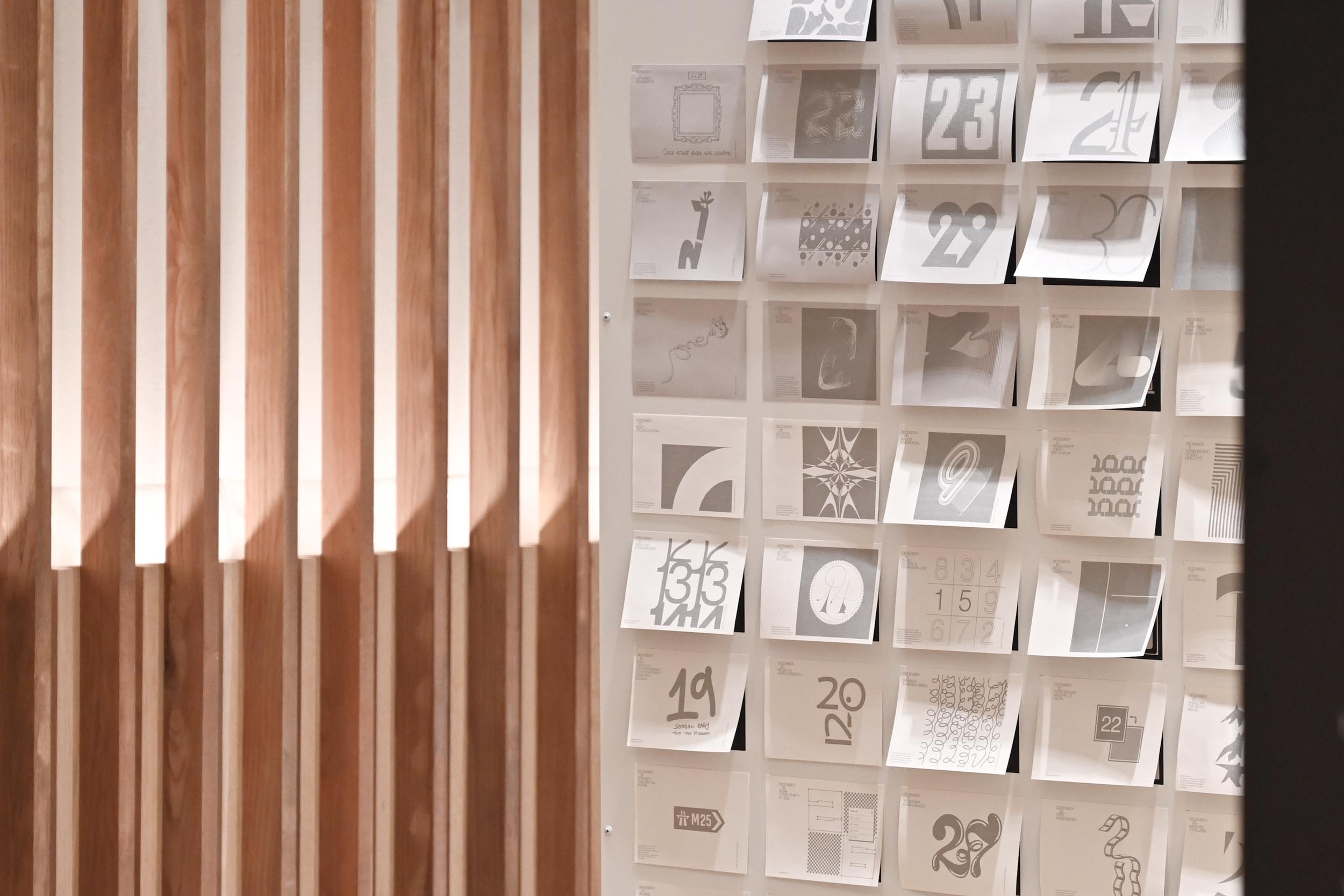
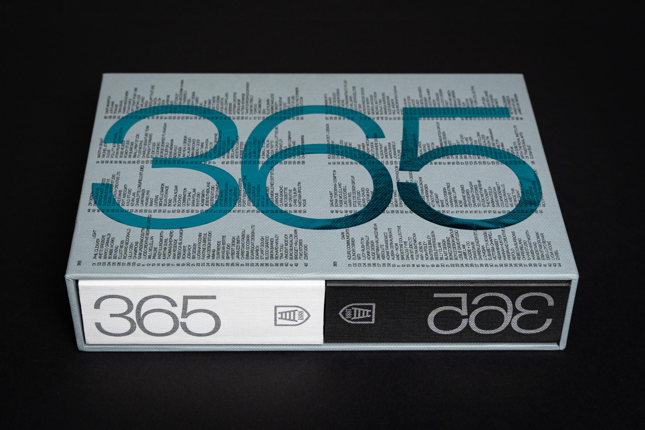
The overarching theme this year, conceived by TM Studio was ‘Opposites.’ A twist on previous years editions, this edition consisted of two volumes, ‘dark’ and ‘light’ housed in a multicoloured slipcase. Each volume would feature designs inspired by opposing seed words, e.g. OLD vs YOUNG. For each shared date, it creates a juxtaposition of two creatives’ works on opposite themes, one in each book.
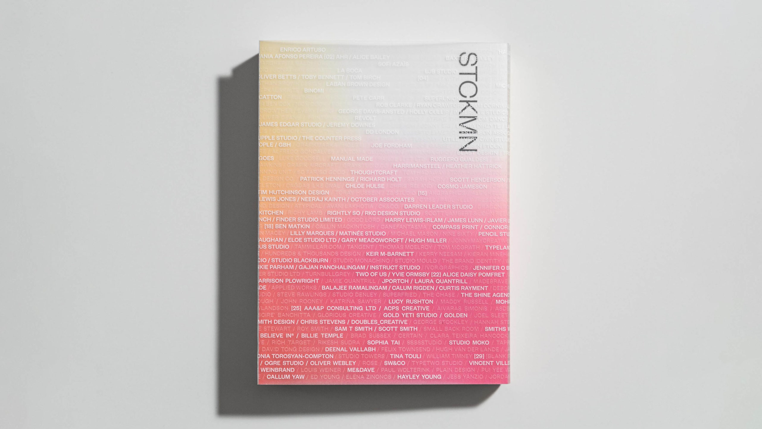
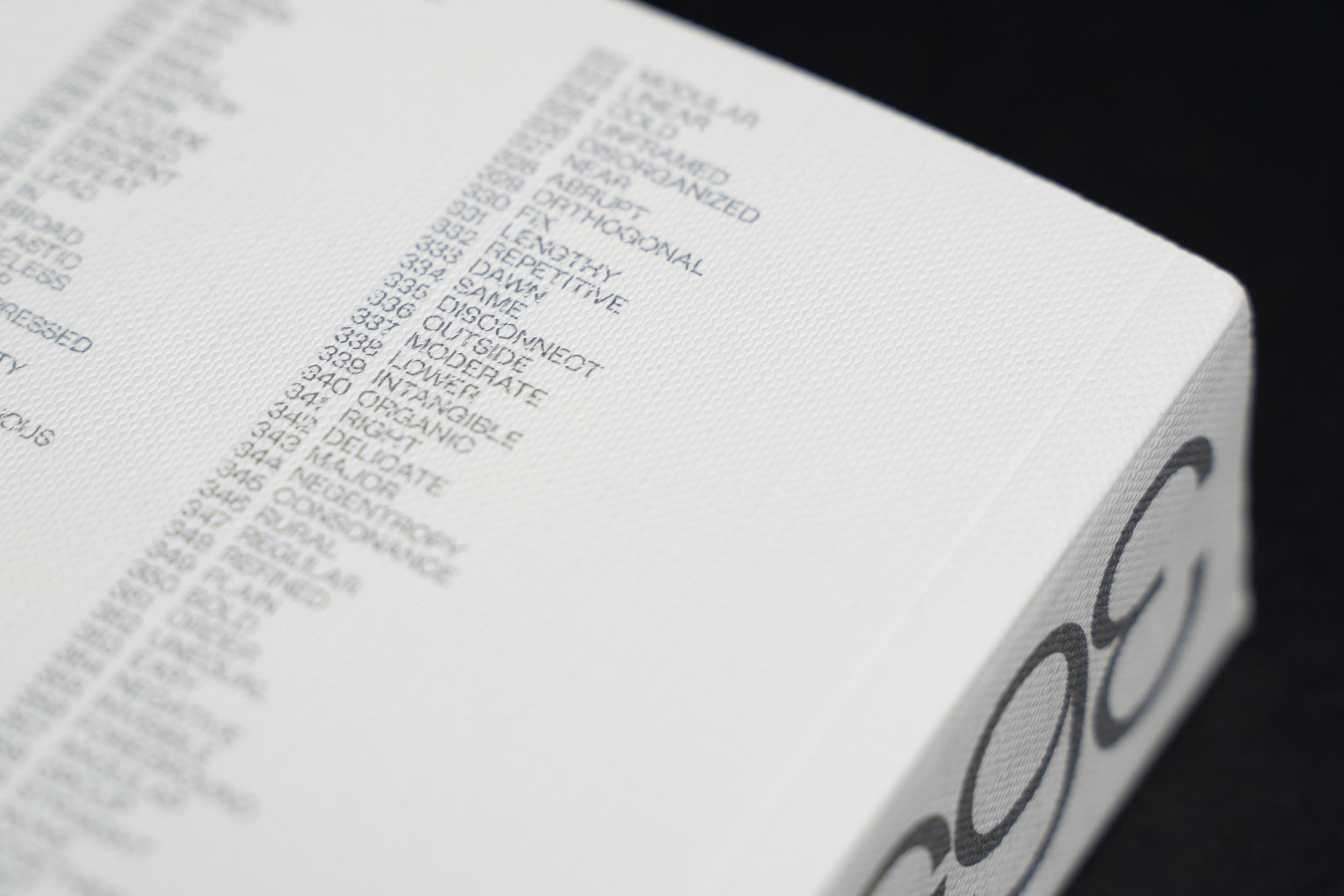
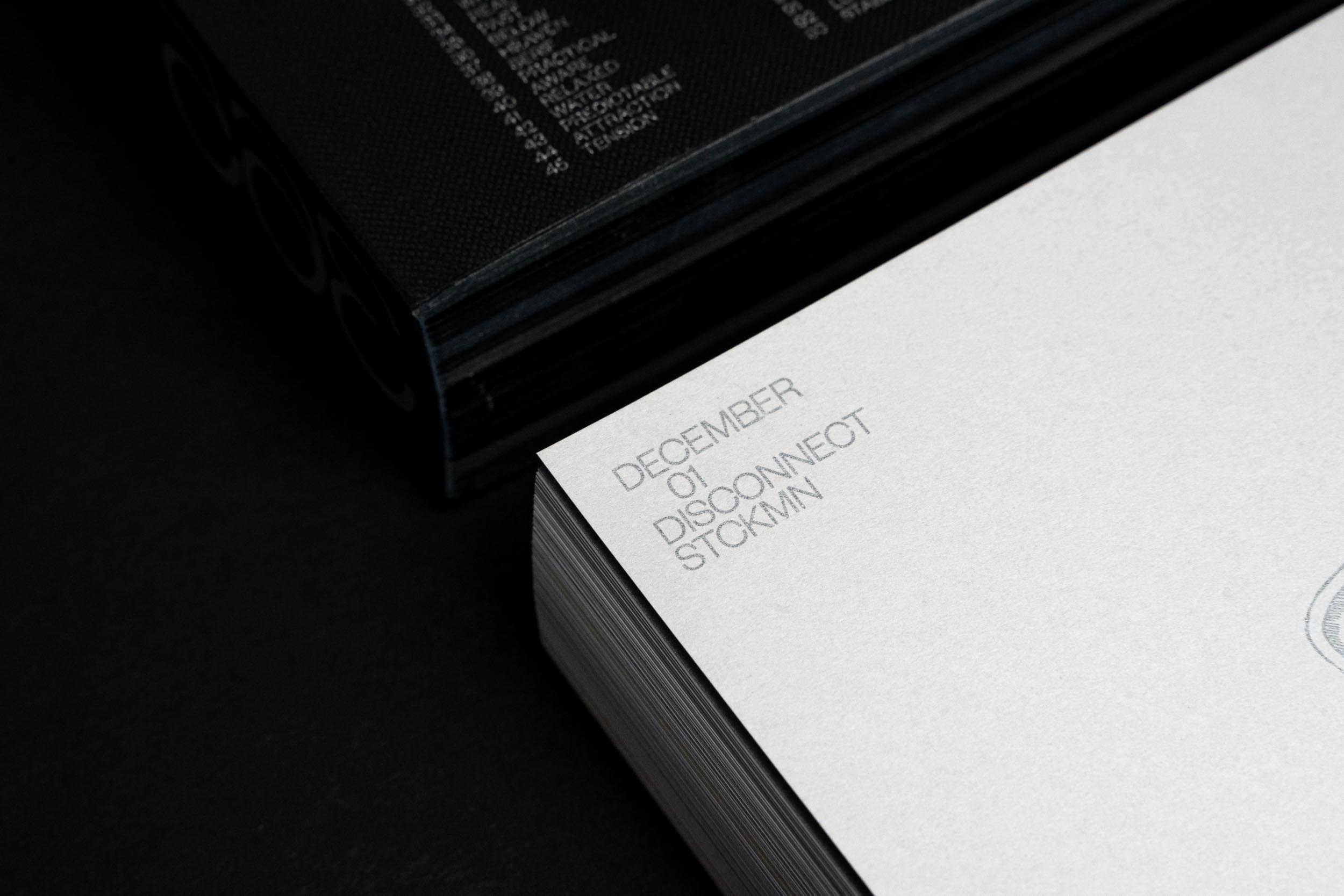
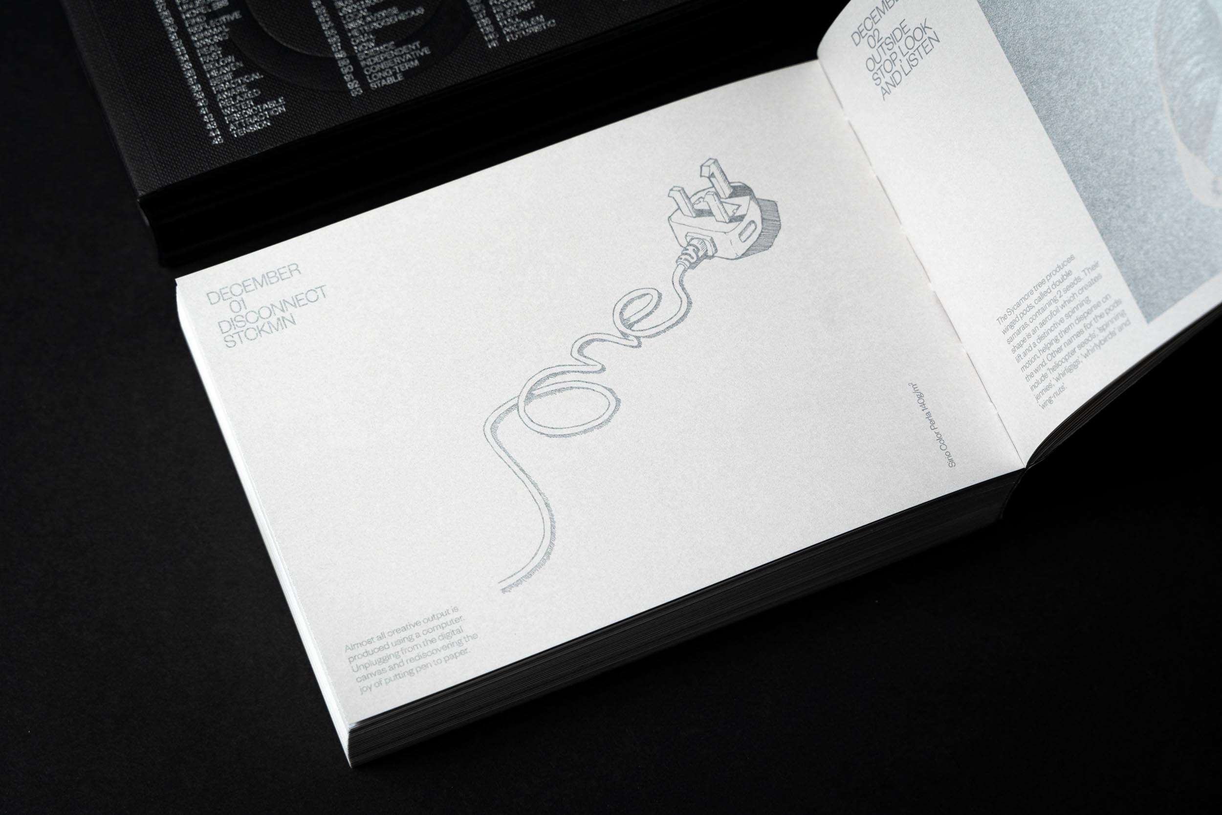
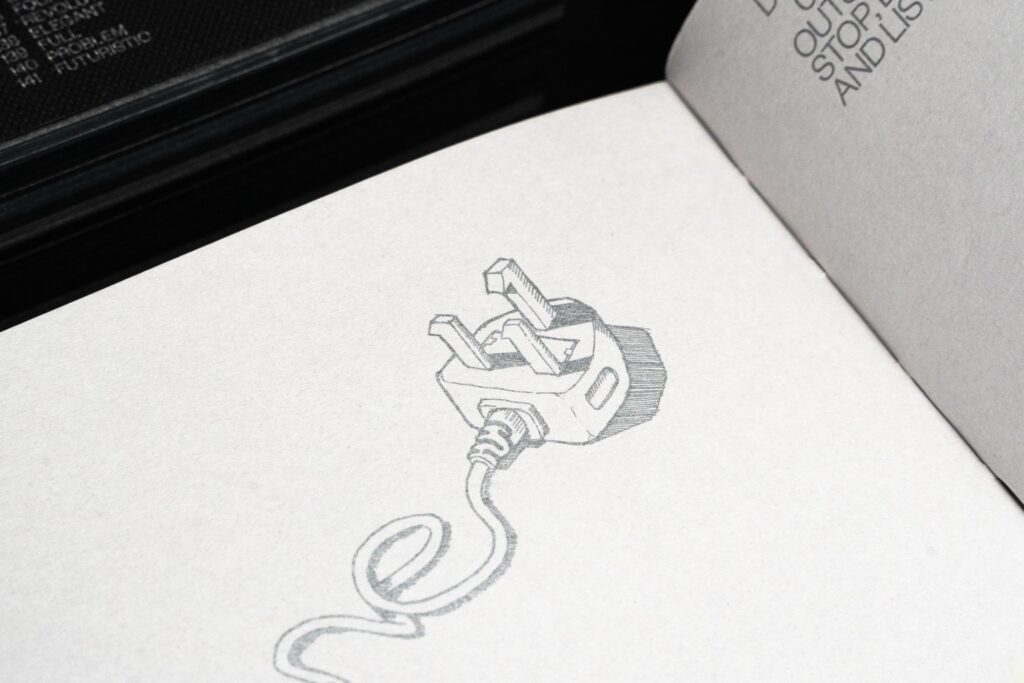
Each of the 730 contributors were assigned a 'seed word' as inspiration for their artwork, I was given DISCONNECT.
I was tempted to jump straight onto the computer to begin exploring possible ideas for my artwork, but taking a lead from what my seed word suggested, I unplugged from my digital canvas and rediscovered the joy of putting pen to paper.
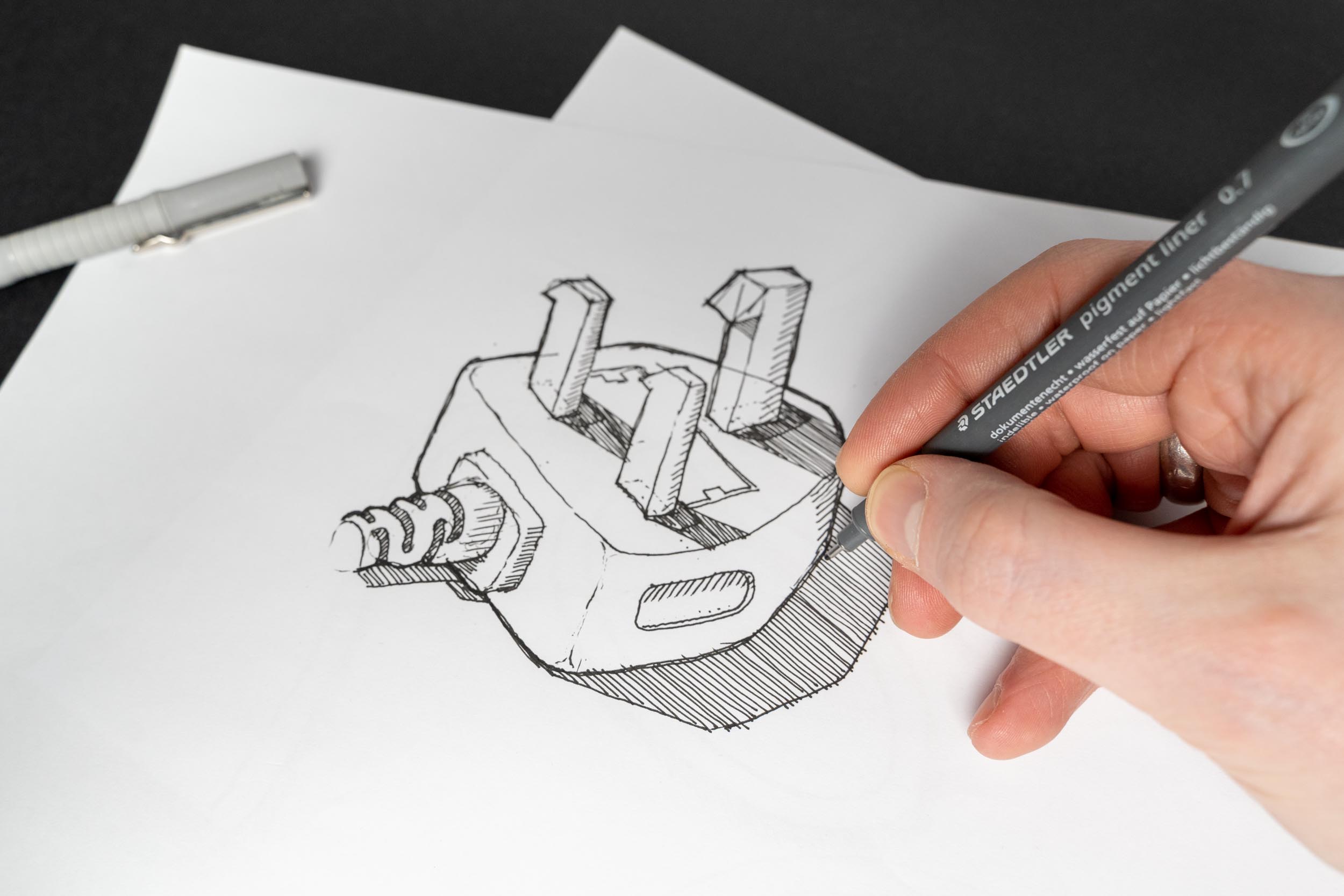
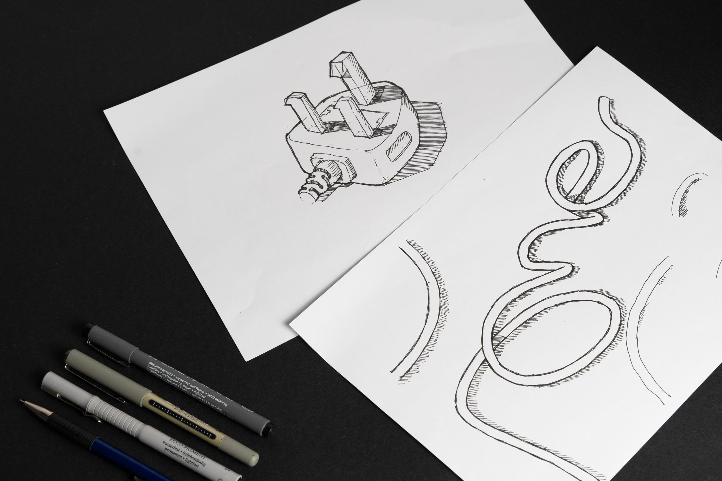
I created a hand drawn illustration of a cable that had been unplugged to represent 'Disconnect' and used the cable to spell out 'one', to represent the given date of 01st December. Additional references to the number 1 were added by making the plugs metallic prongs appear like numbers.
The artworks were showcased at exhibitions across the UK.
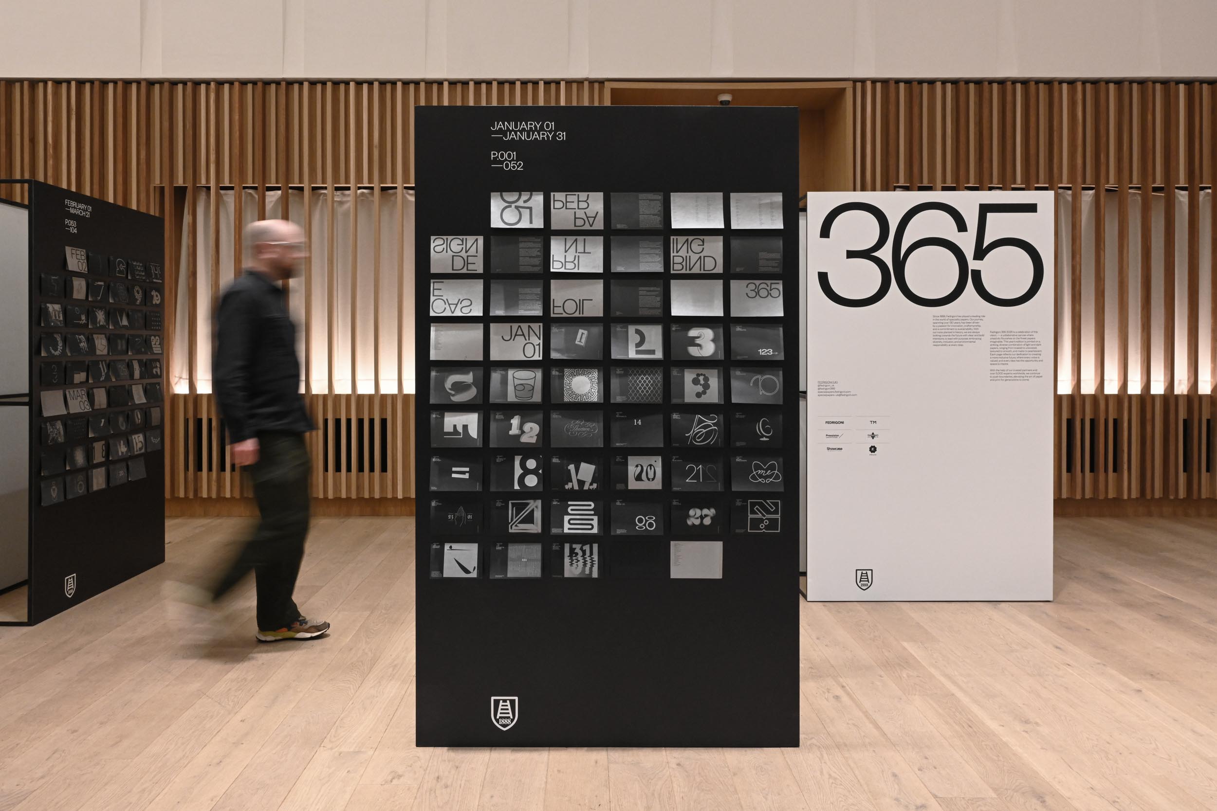
It was a great to see my artwork displayed among the other talented contributors. The project is a welcome change from client work as it frees me up to be more expressive and playful with the approach.
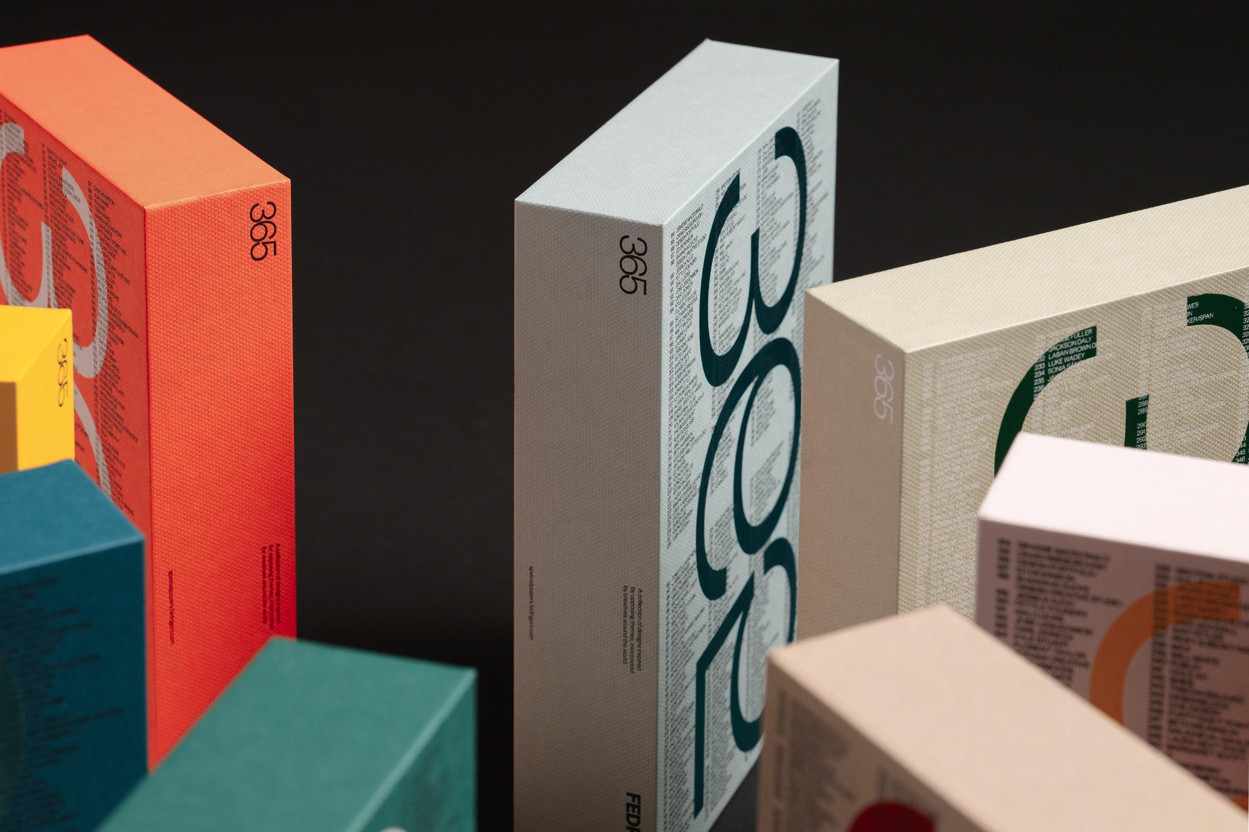
The project’s production reflects craftsmanship and attention to detail, with printing and foiling managed by Pressision and binding by Diamond print Services. The slipcase was crafted by Showcase Creative, incorporating different shades of papers with matching foils, supplied by Foilco.
Pick up a copy at Counter Print Books.